
The third data visualization technique we will cover is a scatter plot. Scatter plots are used to visualize the distribution of 2 numerical
variables at once. Both discrete and continuous numerical variables can be visualized using a scatter plot. A scatter plot involves plotting
each row's values from the two columns associated with the 2 variables using the first column as the x-axis and the second column as the y-axis.
The scatter plot block takes in 5 arguments, 3 that are required and 2 that are optional:
Scatter plots are used to visualize the relationship between the data in 2 columns. There are 3 general relationships we can observe: positive correlation, negative correlation, or no correlation. There are statistical methods to mathematically determine which of the 3 a given relationship is, however we will not cover these methods in these assignments.
Correlation means that the two columns tend to reflect patterns in each other. As we have mentioned before in a previous assignment, correlation does not imply causation, so there may not be a readily available reason for the positive correlation. In cases of positive correlation, lower values of one column tend to have lower values of the other and vice versa. In cases of negative correlation, lower values of one column tend to have higher values of the other and vice versa.
Let's look at some standard uses of the scatter plot block:
Let's say we wanted to see relationship between a penguin's body mass and its flipper length:

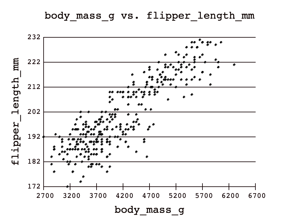
Note the bottom left to top right general shape of the plot. This scatter plot shows the relationship between body mass and flipper length to be positively correlated.
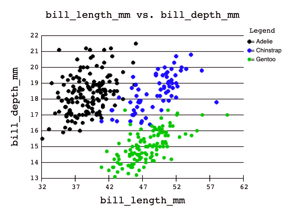
Using the optional third column argument to group the rows before plotting can show us additional patterns about the values in that third column. Let's take a look at an example of how this can be useful:

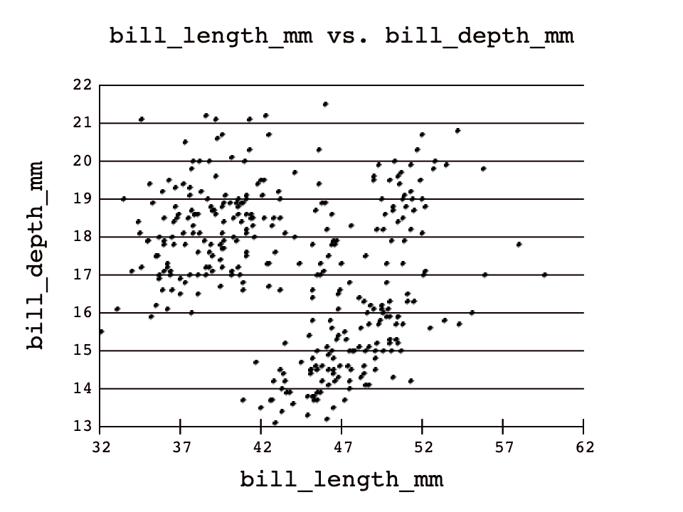

In the first plot without grouping by species, there appears to be no correlation between bill_length_mm and bill_depth_mm.
However, by grouping on the species column, we can see 3 slightly positive correlations amongst each species! Scatter plots like this can be used in
machine learning because computers can start to answer questions like: Based on the dimensions of its beak, which species of penguin could this beak belong to?.
You could probably make a pretty good guess yourself given a random penguin's beak dimensions, and so could a computer. The most exciting part of that is that
neither you nor the computer would have ever had to see a penguin, or in the computer's case, even know what a penguin is!
Don't be intimidated with the term machine learning; data scientists use it all the time, and with the skills you are learning in these assignments, you too can start to comprehend fundamental ideas in machine learning!
Feel free to see the relationships between other numerical variables in this dataset, and see what kinds of cool patterns you can find!